LIME & SHAP Explained:
From Computation to Interpretation
An Interactive Visual Guide to Understanding and Interpreting Local Explainable AI Methods
Understanding the predictions of complex AI models ("black-box models") is essential for building trust and ensuring transparency in domains such as medicine [1], finance [2], law [3], and many other fields. While global explanations summarize overall model behavior, local explanations zoom in on individual predictions, revealing why a model made a specific decision for a particular data point. Among the most widely used local explanation techniques are LIME and SHAP. Both methods are model-agnostic, meaning they can explain predictions from any model architecture, whether it's a neural network, random forest, or any other black-box system. These methods produce feature attribution vectors that describe the influence of each feature on a single prediction. However, the process of generating these explanations—and interpreting them correctly—is far from straightforward.
How exactly are these attribution values computed? What do they truly represent, and how do their meanings differ between methods? Can we compare them directly across different instances or models? And most importantly, how can we avoid common pitfalls that lead to misleading conclusions?
This article takes a closer look at these questions, unpacking the mechanics behind LIME [4] and SHAP [5], clarifying what their outputs mean, and outlining best practices for interpreting local feature attributions without falling into common traps.
How do LIME and SHAP work?
Both methods explain prediction instances in the form of feature attribution. However, there are fundamental differences in their algorithms.
LIME (Local Interpretable Model-agnostic Explanations)
LIME explains the prediction of any black-box model by generating samples near the instance to be explained, querying the model for their predictions, and then fitting a simple, interpretable model (such as linear regression) to approximate the local behavior. The coefficients of this surrogate model reveal which features are most important for the prediction in that local region.
Note: Both LIME and SHAP can be applied to classification and regression tasks. The examples below demonstrate LIME with a classification task and SHAP with regression tasks.
The LIME algorithm follows five key steps:
- Perturbation: Generate samples by slightly varying the input features around the target instance to be explained.
- Prediction: Obtain predictions from the black-box model for all perturbed samples.
- Weighting: Assign weights to samples based on their proximity to the original instance, emphasizing local neighborhood behavior.
- Surrogate Training: Fit an interpretable model (e.g., linear regression) using the weighted samples and their corresponding predictions.
- Extract Explanation: Derive feature importance scores from the surrogate model's coefficients.
Interactive Demo
Explore how LIME explains a non-linear binary classifier's decisions on 2D data. The visualization demonstrates the step-by-step process of creating local linear approximations near the decision boundary.
Use the sliders to adjust the number of perturbations and their radius.
LIME Instability: Even when running the experiment multiple times under the same conditions, you may observe different results. This is due to random perturbation sampling, which introduces instability.
SHAP (SHapley Additive exPlanations)
SHAP is based on Shapley values from game theory, where each feature is treated as a "player" in a cooperative game. The key idea is to fairly distribute credit among all features for moving the prediction from a baseline to the target value. While there are various approximation methods for SHAP (such as TreeSHAP, KernelSHAP, and others), here we demonstrate a simple and effective permutation-based approach to calculate marginal effects by systematically permuting feature combinations.
Interactive Demo
Explore how SHAP explains a regressor's decisions using 3 dimensional data. With three features—Age, Income, and Credit Score—the model predicts a target value (loan approval probability).
Understanding the Baseline: The SHAP baseline value represents what the model would predict if we knew nothing about the specific instance—essentially the model's "neutral" starting point. In practice, this is typically the average prediction across all training data. In this demo, our baseline is set to 0.3, while the target instance has a prediction of 0.65. SHAP explains how each feature contributes to moving the prediction from the baseline (0.3) to the final target value (0.65). Each feature either pushes the prediction higher or lower, and together they account for the total difference of 0.35.
With these three features, we can generate 3! = 6 different permutations of feature order. For each permutation, we calculate the marginal contribution of each feature at every step. For example, if we calculate the output with feature A, then with features (A, B), the difference between these two outputs is the marginal contribution of feature B. This process repeats for all permutations and steps, allowing us to visualize how each feature contributes to the final prediction. Click "Next Step" to see how the model's prediction changes as we add each feature in each permutation. After 18 iterations (6 permutations × 3 features), we'll have the final SHAP values for each feature.
1 / 6
Order: Age → Income → Credit Score
0 / 3
Baseline (No features)
0.300
Baseline: 0.300
Target: 0.650
Marginal Contribution Calculation
Baseline State
f(∅) = 0.300
No features known - starting point
Interpreting "Local" Explanations
What Do These Numbers Mean?
For the same regression model trained on the California housing dataset, we generated explanations for the same test instance. This dataset contains information from the 1990 California census (20,640 instances with 8 features), and the task is to predict the median house value for California districts.
The visualizations below present the numeric values each method assigns to every feature for that prediction. LIME (left) and SHAP (right) produce different values for each feature. At first glance, these bars may look like simple weights for each feature, and the two charts may even appear similar in form. However, the characteristics of the two methods differ significantly depending on how each method computes these values. Before interpreting these differences, let's first clarify the characteristics and meanings of the numbers produced by each method.
Feature descriptions
- MedInc: median income in block group
- AveOccup: average number of household members
- Latitude: block group latitude
- Longitude: block group longitude
- HouseAge: median house age in block group
- AveRooms: average number of rooms per household
- AveBedrms: average number of bedrooms per household
- Population: block group population
LIME
LIME values are coefficients from a linear surrogate model trained to approximate the black-box model's behavior in the neighborhood of a specific instance. These values indicate each feature's attribution with both magnitude and direction of influence on the prediction.
Key characteristics- Local approximation: Assumes the complex model behaves linearly in the local region
- Instance-specific: Each prediction gets its own surrogate model
- Inherent variability: Results can vary due to random perturbation strategies [6] and sampling methods [7]
- Not comparable across instances: Different surrogate models mean coefficients are not on the same scale
SHAP
SHAP uses Shapley value to measure each feature's marginal contribution relative to a fixed reference baseline.
Key characteristics- Marginal contribution: SHAP calculates each feature's contribution by systematically adding it to all possible combinations of other features and measuring the average change. This game-theoretic approach ensures fair attribution, asking "If we start from the baseline prediction and add this feature into all possible combinations, how much does it change the prediction on average?"
- Baseline dependency: SHAP values are defined relative to a chosen baseline (typically the average prediction across training data). Changing the background dataset can alter both the magnitude and direction of feature attribution for the same instance [8] [9]. The choice of background data affects the explanation as it defines the reference point for attribution.
To illustrate this background effect, let's examine the same model prediction for the same instance under two different baselines. In the first case(Right, same as above example), the baseline is the entire training set, while in the second case(Left), it is a subset of training examples filtered to represent high-income neighborhoods with
MedIncgreater than the Q3 value.These two baselines produce different baseline values (E[f(X)] = 1.99 for the full training set representing the average housing price, and E[f(X)] = 3.23 for the high-income subset representing the average price in affluent neighborhoods) while the model prediction for this specific instance remains unchanged at 1.71. Because SHAP values are computed as the difference between the prediction and the baseline, the change in baseline value alters both the magnitude and direction of the feature attributions, even though the model and the instance remain unchanged. So, do not interpret SHAP values as probabilities or raw feature weights (e.g., "A SHAP value of 0.3 means this feature contributed with 30% probability")import shap
...
high_baseline = X_train[X_train["MedInc"] > X_train["MedInc"].quantile(0.75)]
explainer_all = shap.Explainer(model.predict, X_train)
explainer_high_income = shap.Explainer(model.predict, high_baseline)
shap_value = explainer_all(test_sample) # Right
shap_value_high_income = explainer_high_income(test_sample) # Left
... - Feature interaction effects are hidden: SHAP values combine both a feature's direct effect and its effects into a single attribution score. While interaction effects can be computed, they are not explicitly decomposed in basic SHAP values. + Additional analysis like dependence plots can help understand interaction patterns.
- Computationally expensive: Usually, calculating SHAP values is often more computationally intensive than generating LIME explanations, as it involves considering many possible feature combinations to ensure fair attribution according to game theory principles. (Tip: try TreeSHAP)
Correct Interpretation of Single Instances
Now that we understand the properties of LIME and SHAP values, let's focus on how to properly interpret these values for a single instance without overreaching or misinterpreting. What can we reliably learn from the feature attribution values we see in a local explanation?
LIME
Remember that LIME coefficients describe the surrogate model's behavior, not the black-box model directly. However, we interpret these coefficients as explanations of the black-box model under the key assumption that the linear surrogate model adequately approximates the black-box model's behavior in the very local region around the instance.
- Local sensitivity: Larger absolute values indicate higher model sensitivity to that feature in this neighborhood
"The model shows higher sensitivity to Feature A than Feature B in this local area" - Directional tendency: Sign indicates the model's observed directional response, not causation
"The model tends to predict higher values when Feature A increases in this local region"
SHAP
- Compare relative ranking and direction within the same instance
Feature A causes a larger change in this prediction than Feature B - Interpret as marginal contributions showing how much each feature shifts the prediction from the baseline
- Direction indicates whether a feature increases (+) or decreases (-) the prediction relative to the baseline
- Compare across instances only when baselines are consistent
Common Pitfalls in Local Explanation
Given these characteristics of each method, it's surprisingly easy to misuse feature attribution values if we're not careful. Let's highlight some of the most common mistakes and misunderstandings that people often make when interpreting local explanations.
DON'T: Misleading Absolute Magnitude
Feature A (0.8) is 4 times more important than Feature B (0.2)
Do not interpret attribution values as absolute or ratio-scaled importance.
LIME: Values come from a locally-fitted linear surrogate, not the black-box model's feature weights. They are affected by feature scales, sampling strategy, and neighborhood definition, and are neither normalized nor directly comparable across features or instances.
SHAP: Values measure the change in prediction relative to a baseline and share the same unit as the model prediction and are interval-scaled—differences (Δ) are meaningful. However, ratio-based interpretations are not meaningful for interval-scaled data (the baseline represents a meaningful reference point, but ratios like "twice as important" are not valid).
DO: Compare Relative Rankings
Compare relative ranking of features within a single instance is reliable most of the time.
Feature A contributes more than Feature B to this prediction
DON'T: Cross-instance Comparison Error
Feature A is more important in instance X than in instance Y
LIME: Each instance has its own surrogate model, and the coefficients are not on the same scale.
SHAP: Additive structure can support cross-instance comparisons but only if baseline and scale are consistent.
DO: Use Caution with Cross-instance Comparisons
Use caution when comparing SHAP values and do not compare LIME values across instances.
DON'T: Generalizing Local to Global
Feature X is important for this instance, so it must be globally important
Do not infer global feature importance from a single local explanation.
Local explanations are case-specific that reflect individual predictions, not population-level trends. A feature that appears important for one instance may be irrelevant elsewhere. While SHAP can reveal global patterns when aggregated across many instances, one example only describes that prediction.
DO: Use Global Explanation Methods
Use global explanation methods like feature interaction, partial dependence plots, or aggregated SHAP analyses to understand dataset-wide trends.
DON'T: Assume Causality
Latitude has the highest positive SHAP value for predicting housing price, so moving to a higher latitude will make the house more expensive
Both LIME and SHAP capture correlational influence in the training data, not causal effects. Attribution means the model uses this feature for prediction, but doesn't guarantee that intervening on it will change the future outcomes.
LIME: measures local linear sensitivity, showing how much the model output changes in a small neighborhood. A high LIME value (coefficient of the surrogate model) means the model is sensitive to that feature locally, not that changing the feature will change future outcomes.
SHAP: quantifies each feature's contribution to moving the prediction from the baseline based on correlations learned from data. It can't distinguish causal effects, confounding, or intervention [10].
DO: Interpret as Model Behavior
Interpret explanations as describing model behavior, not to infer future outcomes or causal relationships.
The model learned that houses in higher latitude regions tend to be predicted with higher prices, but this does not mean that simply moving a house to a higher latitude will increase its price
DON'T: Ignore Feature Interaction
Feature Z has low attribution, so it's unimportant at all.
Interaction effects may be hidden, a feature with low attribution could still be important through its interactions with other features.
LIME: assumes local linearity and perturbs feature independently, which can miss complex feature interactions.
SHAP: values include both a feature's main effect and interaction effects, but don't explicitly show in values. These can be separated, and visualized with dependence plots [11] [12].
DO: Check for Interactions
Check for interactions by examining SHAP interaction values or using dependence plots.
Visualizing Local Explanations
Both LIME and SHAP produce (feature, attribution) pairs for each prediction. For tabular data, the most basic and intuitive way to visualize these pairs is a bar chart as shown above. Let's explore more intuitive and helpful visualization techniques for local explanations.
This section starts with simple questions:For a single explanation, are there alternative visualization methods beyond the basic bar chart?
For multiple explanations, is it possible (and meaningful) to merge them into a single visualization?
Let's take a closer look at each method below to answer these questions.
Visualization for LIME and SHAP
LIME: Analyze explanations one by one, as there is no common scale for aggregation across instances.
Alternative single-instance visualizations (such as vertical bar charts or feature rankings) can be explored. Aggregating multiple LIME explanations into a single visualization is generally problematic, since each explanation is on its own local scale.
However, in some cases, you may try simple aggregation approaches—such as counting how often a feature appears as important, or averaging normalized LIME values across instances—but these methods should be interpreted with caution, as they do not provide the same consistency or comparability as SHAP.
SHAP: Values are additive and use a consistent baseline across instances. This allows meaningful aggregation and comparison, as all SHAP values are aligned to the same reference. Always ensure baseline consistency for correct interpretation.
In the next section, we will explore several SHAP visualization methods. Example visualizations include bar plots, waterfall plots, force plots, beeswarm plots, and heatmaps.
SHAP Visualization
SHAP explanations can be visualized in various ways thanks to their additive nature and consistent baseline.
Here, we use a regression model with a 5-dimensional dataset to predict the probability of loan approval.
Bar & Waterfall Plots for an Instance
Let's begin with the most basic visualizations. Both display the SHAP value for each feature in a single instance, but differ in how the bars are aligned. In a Bar Plot, all features are aligned at 0, though the reference point is the baseline prediction. The length of each bar represents the magnitude of the SHAP value, and the direction shows whether the feature pushes the prediction down or up from the baseline. Waterfall Plot visualizes the step-by-step contribution of each feature from the baseline prediction to the final prediction. The starting point of each bar is the ending point of the previous bar, representing cumulative effect. In the animation below, we start with a bar plot then transition to a waterfall plot.From Bar to WaterFall: Bar Plot
- Model baseline (average prediction): 0.500
- Prediction for this instance: 0.550
- Difference (Sum of contribution of all features): 0.050
Force Plot for an Instance
Unlike waterfall plots, force plots center all bars around f(x). Positive contributions (red bars) are positioned to the left of f(x), representing features that push the prediction away from the baseline E[f(x)] in the positive direction. Negative contributions (blue bars) are aligned to the right of f(x), showing features that pull the prediction toward lower values.SHAP Force Plot
- Model baseline (average prediction): 0.500
- Prediction for this instance: 0.230
- Difference (Sum of contribution of all features): -0.270
Summary Bar Plot and Heatmap for Multiple Instances
Now, let's aggregate the three instances examined above and start with the simplest method: the summary bar chart.The summary bar chart shows the mean absolute SHAP value for each feature, providing a quick overview of feature importance across all instances. This makes it easy to rank features at a glance, but it loses information about directionality and individual instance trends.
In contrast, a heatmap displays the SHAP value for each feature and each instance, allowing you to see both the strength and direction (positive/negative) of SHAP values, as well as trends across instances.
Summary Bar Plot & SHAP Value Heatmap
Beeswarm Plot for Multiple Instances
The beeswarm plot visualizes SHAP values across multiple instances and features simultaneously. Each dot represents a single instance and feature, positioned horizontally by its SHAP value (how much it pushes the prediction from the baseline), and colored by the corresponding feature value. This dual encoding enables interpretation of both magnitude and direction of feature effects, as well as how feature values relate to their impact on model predictions. For example, a feature whose SHAP values are consistently near +0.5 across instances shows a stable, reliable contribution. In contrast, a feature with wide SHAP value spread (e.g., –1.0 to +1.0) shows high variability, but not necessarily higher importance. High variability in SHAP values for a feature means its effect on the prediction changes significantly across different instances, sometimes increasing, sometimes decreasing the output. This suggests the feature interacts with other variables or its influence depends on context. However, variability does not equal importance. A tightly clustered feature may have more consistent influence than one with scattered effects. When interpreting beeswarm plots, consider both the spread (variability) and the absolute values (magnitude) to fully understand each feature's role in the model's decisions.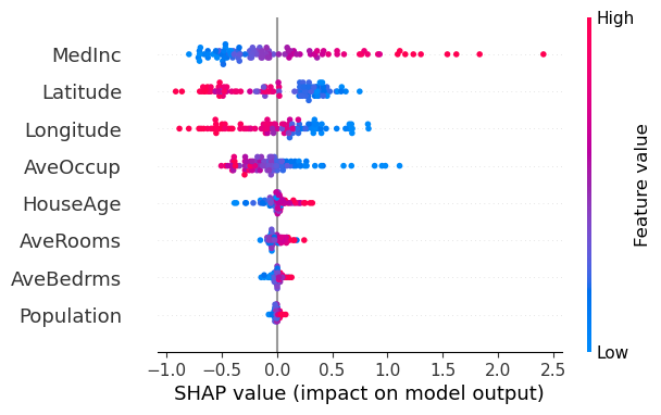
In the California housing example above, several trends emerge from the feature value–SHAP value relationship:
- MedInc: Higher income (red) is consistently associated with an increase in predicted price.
- Latitude: Homes farther north tend to be associated with higher predictions.
- AveOccup: Larger households (red) are associated with lower predictions.
However, some features like HouseAge or AveRooms do not exhibit a clear correlation between feature value and effect direction, suggesting less consistent influence.
Also, visual patterns in beeswarm plots depend on dataset composition. If distinct subgroups (e.g., geographic regions or income levels) are mixed together, meaningful patterns can become obscured [13]. Consider segmenting your data, for example, by output value ranges to better understand how feature effects vary across different prediction bands.
Suggestions for Your Visualization
In addition to the visualizations discussed above, there are other useful options such as aggregated force plots, violin plots, and decision plots. Regardless of the method you choose, keep these practical tips in mind to ensure your visualizations guide interpretation accurately.DO
- Show directionality (+/-) and the baseline prediction.
SHAP values represent how each feature pushes the prediction up or down from a baseline. Omitting this reference point can make the visualization ambiguous or misleading. - Use a consistent baseline when comparing instances.
In most cases, using the same reference (baseline) ensures that SHAP values are directly comparable across samples.
If different baselines are used (for example, when analyzing distinct subgroups separately), you can still interpret SHAP values within each group, but direct comparison between groups may not be meaningful.
Always clarify the baseline setting when presenting or comparing SHAP explanations.
DON'T
- Don't rely solely on mean absolute SHAP values (mean |SHAP|).
While helpful for quick overviews, they hide direction and variability. Supplement with visuals that show sign (±) and spread to convey the full picture. - Don't aggregate across heterogeneous subgroups without segmentation.
Combining different classes or population instances in a single summary plot may cancel out important patterns. To avoid misleading averages, consider faceting by group or output range.
Summary
When to Use LIME vs SHAP
LIME is preferable when you need to quickly focus on individual cases, especially in domains where localized, case-specific insight is crucial (such as healthcare), or when working with high-dimensional data like images and text [14].
SHAP is more suitable when comparing multiple instances or when sufficient computational resources are available for comprehensive feature attribution analysis.
Conclusion
Understanding how local explanation methods like LIME and SHAP work, and how they differ, helps us generate more reliable and transparent machine learning explanations. This article explored their internal logic, visualization strategies, and interpretation considerations to support informed use in practice. By leveraging these techniques, practitioners can not only interpret model predictions but also select meaningful features and discover patterns within data—making them valuable tools throughout the ML workflow.